BLOG

How to use fonts to elevate your brand | Do’s and Don’ts

As a photographer, providing an unforgettable experience for your clients is what can make you stand out as a creative business. A strong brand identity is essential to achieve this goal, as it affects how clients perceive you through all touchpoints, including your website, email communication, and social posts. By investing time and thought into creating a consistent and compelling brand, you can attract the right clients and establish yourself as a professional.
Fonts are a big part of your branding. They’re like a secret sauce that amplifies your message and makes your voice heard. They dictate whether your website feels timeless and elegant, bold and adventurous, or playful and trendy.
With so many options available out there, choosing the right font to represent your brand can feel overwhelming. There are two main things you should take into account before deciding which fonts to use on your photography website:
- The type of impression you want to convey for first-time viewers. What words, feelings, and emotions do you want your brand to be associated with?
- The type of audience you want to attract. What aesthetics, tone of voice, visual style, and communication is familiar to your ideal clients?
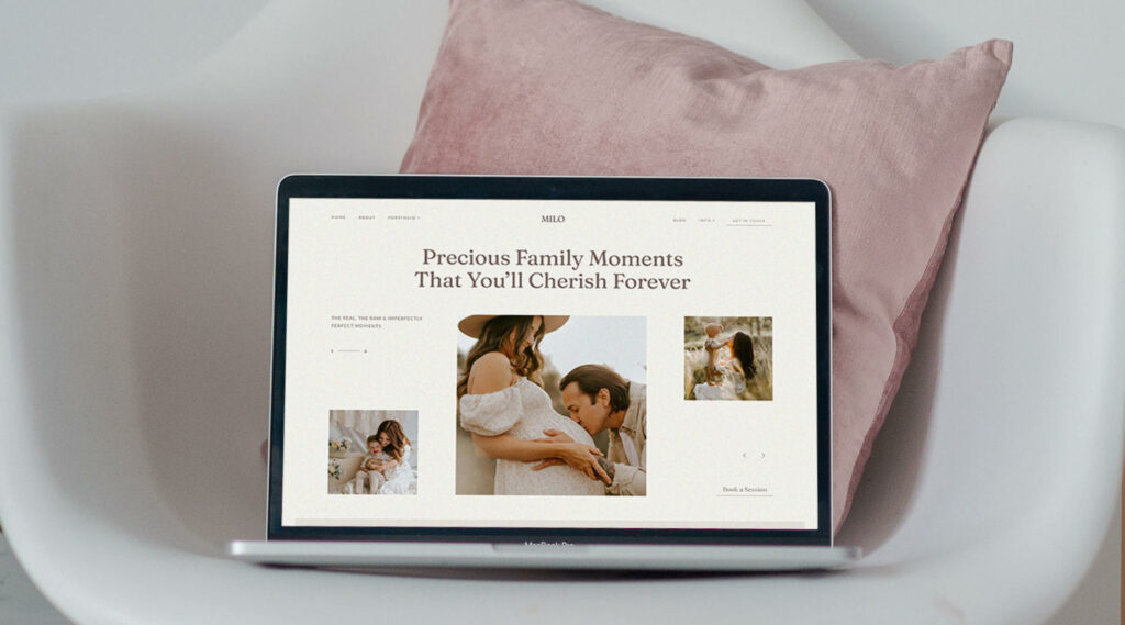
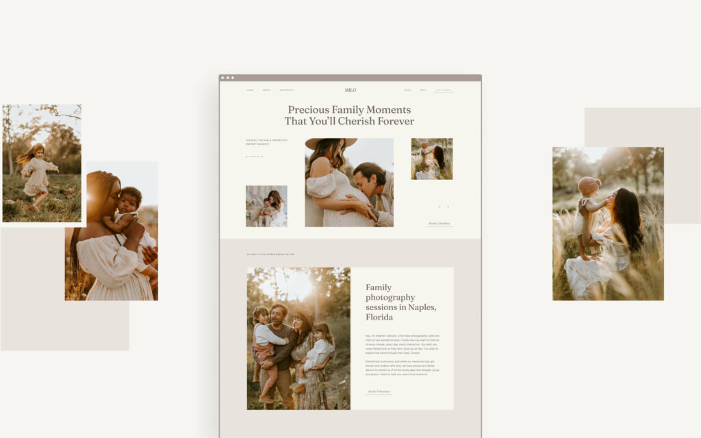
Writing out the answers to both of these questions will help you narrow down the type of fonts you should use to represent your brand and complement your creative work. For instance, many elopement and landscape photographers often use bold, sans serif fonts, with a typewriter effect to create a feeling of adventure, traveling, and wanderlust on their site. Fine-art photographers are prone to minimalist serif fonts and handwritten script typography that create a more refined, timeless feel to their work.
When choosing fonts, the most important thing is to be intentional and clear about the goal you want to reach. If you’re not sure where to start, we’ve shared a list of Do’s and Don'ts when choosing fonts for your photography website.
Below you’ll find some best practices and recommended tips when working with fonts on your website. They will guide you on how to create a consistent visual style and provide your site visitors with a comprehensive aesthetic across your main communication channel.
3 Do’s when working with fonts
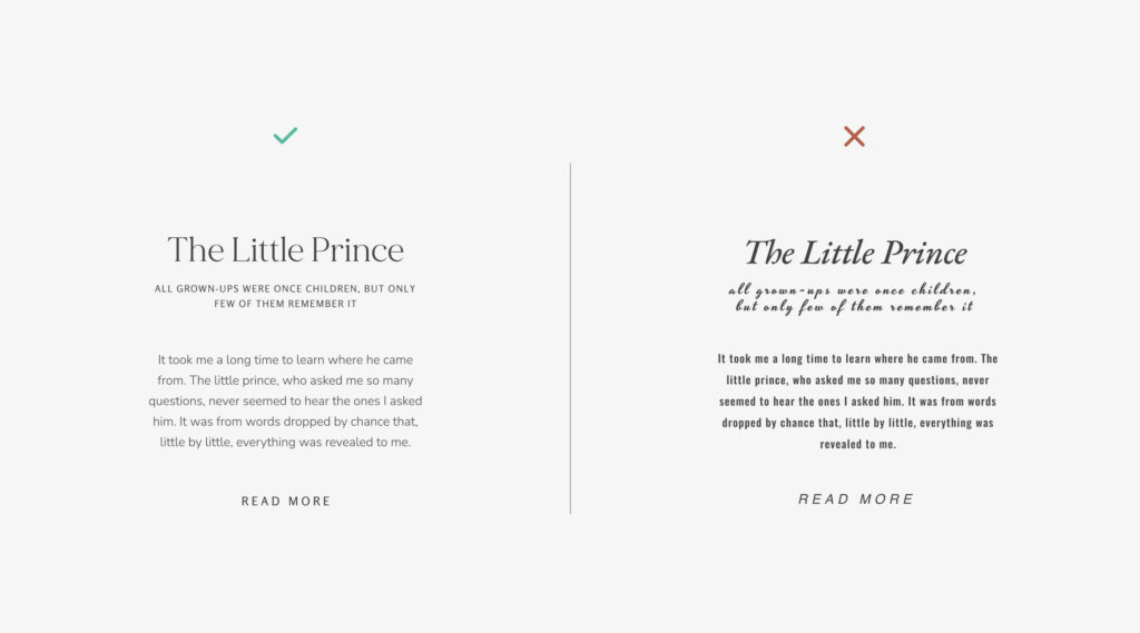
1. Pair fonts well
Using fonts that work harmoniously together can further elevate your presentation and help add more character to your branding and website. Keep in mind that the fonts you use need to complement each other, and not compete for the viewer’s attention. For instance, if you have a large, bold font used for your titles, choose a more neutral font for your paragraphs, to maintain that visual balance. Check out our article on 10 fonts and color combinations for your website, for more examples and ideas.
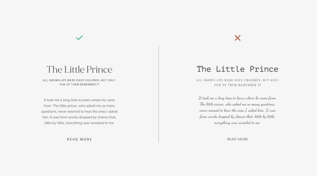
2. Create hierarchy
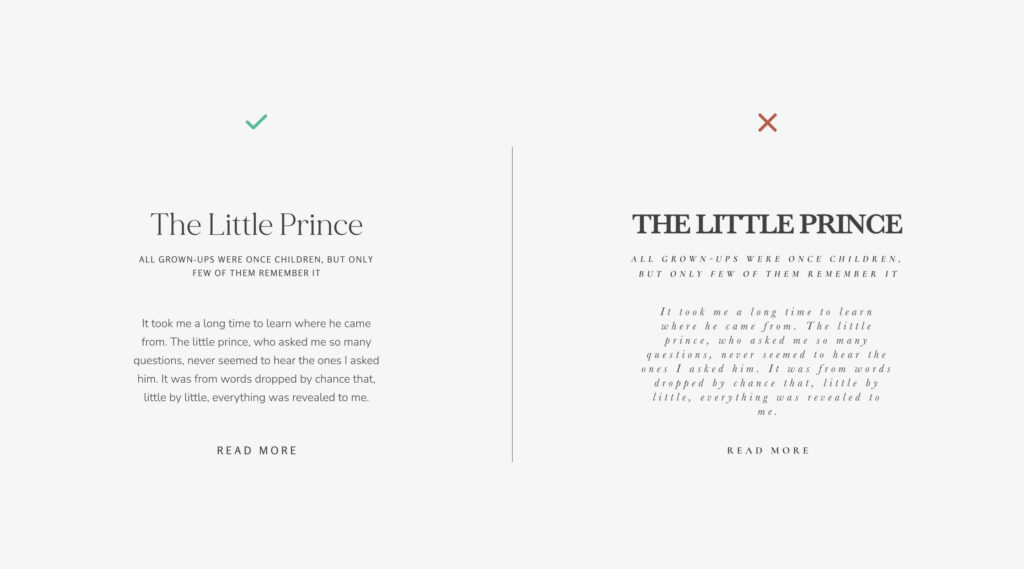
Help your visitors read the content of your website by having a clear structure that is easy to follow from top to bottom. Organize your message into headings, subheadings, body font and call to action text or buttons. Ensure that the font size for your H1, H2 and H3 are in line with the hierarchy and don't compete with each other visually (i.e. your H2 can't be as large or larger than H1).
3. Tell a story
As mentioned earlier, fonts can help you create a certain mood and feel on your website. Depending on how you position your brand — playful, modern, timeless, adventurous, moody — you’ll need to pick fonts that support your brand identity. For example, as a fine-art photographer, you can choose delicate and airy fonts that associate with classic hand written notes. If your photography style is colorful and playful — pick bolder fonts, with a more unique structure, so they accentuate your portfolio.
3 Don’ts when choosing fonts
1. Don’t overdo it
It can be tempting to use a wide range of fonts because they all look great and unique, but less is more. Stick to two font families, and use their styling options to bring more diversity and accent when needed. With most font families, you’ll have bolder and lighter formats of the same font, plus italic. These are more than enough to get creative. Remember to set some rules for how each font is used, and apply those rules on every inch of your website. For example, all paragraphs on your site should use the same font family, same style and same size. Set styling rules on how you present titles, testimonials, quotes, etc. and keep things consistent.
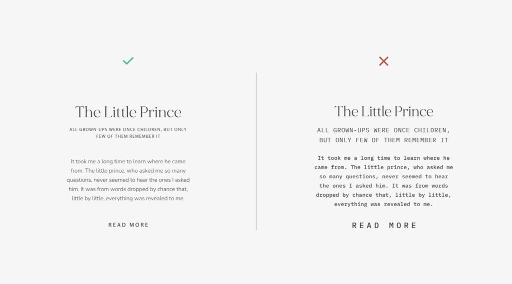
2. Don’t hinder readability
While design and aesthetics are important, the main purpose of your website is to connect with your current and potential clients, through your images and words. Your messaging on the website is meant to motivate site visitors to contact you, and ultimately book your services. To ensure your message gets across, avoid fonts that make it difficult to read your text. For example, a script font might look lovely in a short title, but it will be overwhelming as a long paragraph, or a button.
3. Don’t change fonts too often
As a photographer and creative person, you might get bored with your current font options and get tempted to switch to something new. Before you begin making any changes, ask yourself what’s the reason for this change. Do your current fonts no longer represent your brand? Do they attract the wrong type of clients? What do you want to accomplish through a new pair of fonts? These questions will help you make a more informed decision.

Create beautiful font combinations for your photography brand
Learning to choose and combine fonts is an essential step when creating a memorable and effective website for your photography business. Applying fonts that fit your style will not only elevate your portfolio, but will also help you connect better with your ideal client.
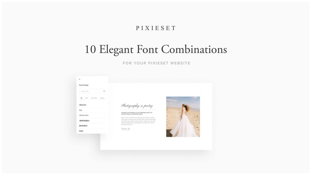
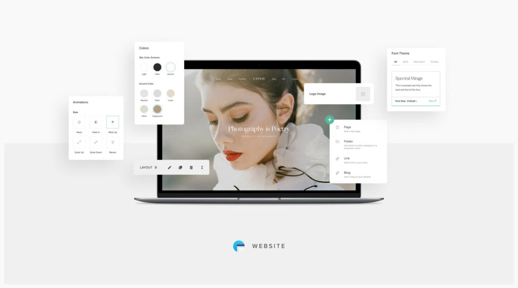
Fortunately, all Pixieset themes come with unique font combinations designed with photographers in mind. Inside your Pixieset Website dashboard, you get access to a library of over 1,000 fonts, and pre-defined font packs. These will help anyone create a unique website that looks beautiful on any device.
Check out our article on elegant font combinations to get more inspiration when building your website. You can also follow this tutorial to learn how to customize fonts on your Pixieset website.
Subscribe to our newsletter to receive monthly updates, useful articles and inspiring interviews.
 Website