BLOG

12 website design trends for photographers

As a creative, you’re always looking for ways to express your unique style — through images, branding, photography style, or website design. Bringing all of that together online should feel just as intentional, which is why Pixieset makes it easy to create a stunning website design, with the tools available inside our builder. If you need some inspiration before you dive into the process, we’ve curated 12 website design trends that photographers should try this year. From timeless and fine-art to playful and bold, you’ll definitely find something that sparks joy.
All the ideas presented below are built with Flex Editor on Pixieset Website. Sign up below to receive a PDF with all the block designs, and learn how you can add them automatically to your own Pixieset site, without designing them from scratch.
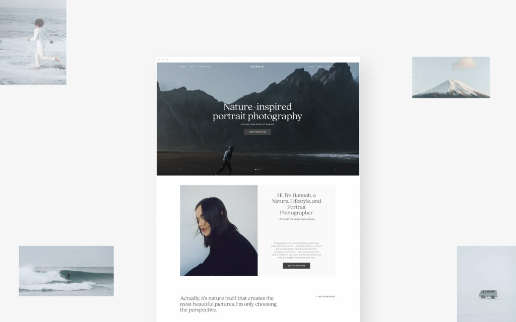
#01. Minimalistic layouts
This design trend is timeless and always in style, working great for photographers, as it puts your images front and center. Opt for a clean, simple layout with ample empty space around photos, to draw attention toward your work. Minimalist design reduces distractions, making it easier for your site visitors to focus on your photos and appreciate your art.
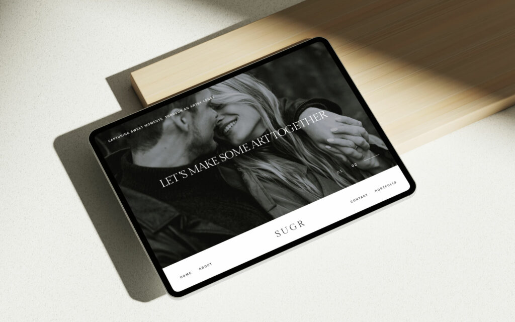
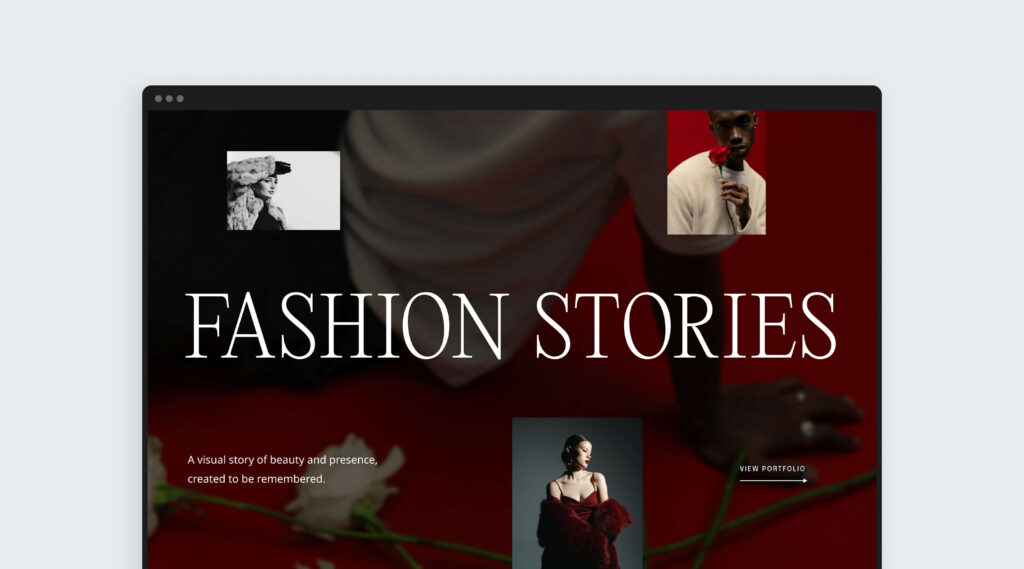
#02 Layered imagery
Want to make a strong first impression? This layout grabs attention and sets the mood of your work immediately. Start with a full-background image to establish the vibe, then layer smaller photos, text, or other details you want to highlight, on top. It’s a highly versatile layout — showcase your portfolio in a cinematic, immersive way that draws visitors in. Or use it for an About Me section with subtle storytelling elements like your portrait, a favorite hobby, or a short bio.
#03 Thin lines
Small details can make a big difference. Add elegant lines and thin borders to separate sections, create hierarchy on your website, and frame your images. Lines will create a grid-like layout, adding a sense of order and making it easier for visitors to skim through the information. A design trick here is to use contrast colors to add more depth and dimension to your pages, such as light lines on dark backgrounds and vice versa.

# 04. Image borders
This trend gives your website the feel of an art gallery or a beloved journal. Framing each image allows it to stand on its own like a piece of art, creating a more intentional, curated look. It works especially well when showcasing images with varied colors, lighting, or moments within the same story. To maintain a polished flow, keep borders consistent while still letting each image shine on its own.

#05. Bold typography paired with images
Bold, chunky typography can transform any ordinary text into a remarkable design element. Whether you want to highlight your brand name or emphasize your main tagline — using a large font paired with images is an easy way to leave a lasting impression.

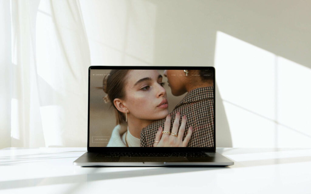
#06. Half and half layouts
“Your website looks like a cover of a magazine” is the kind of feedback you can expect to receive when incorporating the half and half design trend. This layout works wonderfully with vertical images on one side, paired with strong quotes or short paragraphs on the other side, creating a sense of balance and symmetry. By using contrasting backgrounds and plenty of empty space, you’ll add even more depth to your pages.

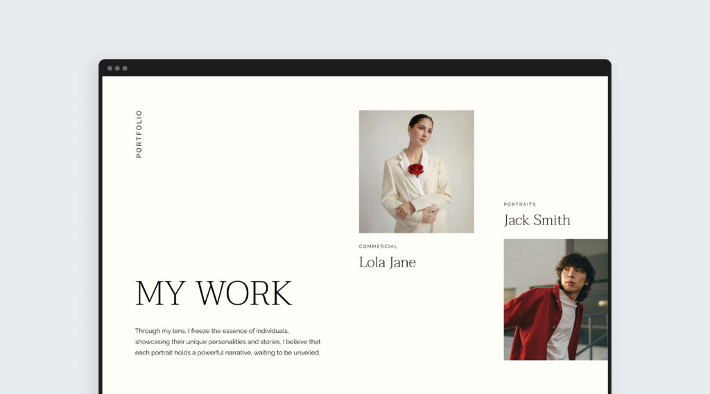
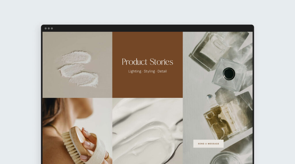
#07. Mosaic Layout
Perfect for product and commercial photographers, but equally impactful across any genre — this option lets you showcase multiple stories in a polished, organized way. It builds on the classic grid by weaving in text, brand names, details, or even “contact me” sections alongside your images. You can also use it as a quick preview that links to a full portfolio page. When creating a mosaic, the key is to choose visuals with similar tones so the layout feels balanced and intentional.
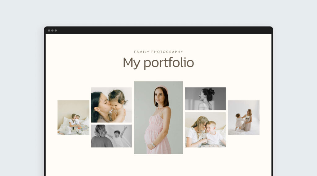
#08. Scattered photo layout
Instead of a perfect grid, this layout gives your images room to breathe, adding a sense of spontaneity and curiosity to your website. The visuals feel scattered, yet intentional, creating a page that’s more natural, more human, and less “designed.” You can also incorporate subtle motion elements, like barely-there GIFs, to introduce playfulness without pulling focus from the photos. Because this layout can’t be instantly “read,” visitors are most likely to slow down, pause, and spend more time taking your work in.
#09. Handwritten fonts
Handwritten fonts bring a personal, romantic touch to your website. When used sparingly, they add warmth and character without distracting from your images. This style works beautifullty for highlighting names, quotes, or meaningful details that gently guide visitors as they scroll. Since handwritten fonts can be harder to read, it’s best to use them for accents or decorative touches rather than for important information or long paragraphs.

#10. Moodboard inspired looks
A moodboard is one of the easiest ways to tell a story, convey emotion and set a vibe without using a single word. Start by curating images that share a similar tone or feeling, then arrange them to create a narrative. Use a moodboard as a hero section to instantly communicate the overall feel of your work. Add a headline that ties the story together, and you’ve got a moodboard that’s both beautiful and impactful.
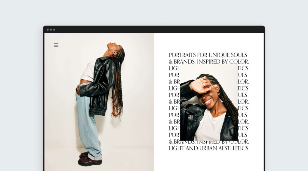
#11. Images on text
Placing an image over a block of text is a great way to add depth and style to your page. This layered approach creates an editorial feel that makes the layout more engaging visually, while the text acts as a subtle backdrop that helps the image stand out. It works especially well for feature sections, statements, or portfolio highlights where you want to make an immediate impression.
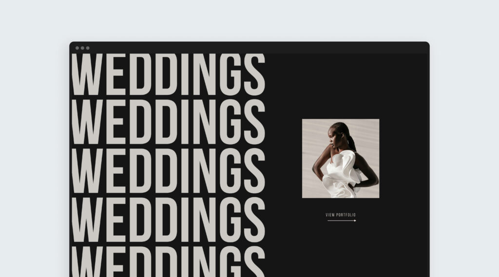
#12. Repeating typography
Repeating text is a bold design trend that adds rhythm, energy, and a strong visual identity to your website. By echoing the same word or title, it creates movement and draws the eye — turning text into a graphic element rather than something meant to be read just once. It’s perfect for headings, portfolio intros, “coming soon” offers, or special announcements.
Add these blocks to your Pixieset website
Love these ideas and want to try them on your website? Sign up and we’ll send you a PDF with all 12 website designs created by our team to help you express your brand in a bold, modern and timeless way. Thanks to our newest features, you can automatically save these designs to your website's block library. The PDF includes written instructions and a video tutorial to walk you through the process.
New to Pixieset Website?
Start with a free account on Pixieset, no credit card required, upgrade only when you’re ready to. Follow the steps in this guide on how to get started with your Pixieset Website.
 Website